Visualizing lake profiles
How to visualize lake profiles with {ggplot2}
By Cory Sauve
December 2, 2021
Overview
In this post, we’re going to cover how to visualize lake profiles using ggplot2. Let’s jump right in!
Some housekeeping
We’ll be using the r4es package for the dataset in this post. It’s currently available on my
GitHub and can be downloaded by:
# install.packages("devtools")
devtools::install_github("corysauve/r4es")
Taking a look at the data
It’s always a good idea to take a look at the data before we try to plot anything:
library(r4es)
dplyr::glimpse(university_lake)
## Rows: 9
## Columns: 28
## $ lake_name          <chr> "University", "University", "University", "Universi~
## $ depth              <dbl> 0, 1, 2, 3, 4, 5, 6, 7, 8
## $ temp_c             <dbl> 25.96, 25.32, 24.60, 23.33, 16.82, 14.35, 12.31, 10~
## $ do_mgl             <dbl> 11.89, 14.78, 11.75, 2.53, 0.40, 0.00, 0.00, 0.00, ~
## $ do_sat_per         <dbl> 162.2, 183.7, 143.2, 30.0, 0.4, 0.0, 0.0, 0.0, 0.0
## $ cond_umhos         <dbl> 310.2, 298.6, 340.4, 386.0, 390.8, 375.8, 359.9, 35~
## $ light_sur_mmol     <dbl> 1817, 3609, 1900, 2528, 3719, 1754, 1519, 1934, 2176
## $ light_dep_mmol     <dbl> 1817.00, 259.10, 23.21, 4.38, 0.00, 0.00, 0.00, 0.0~
## $ ph                 <dbl> 8.9, 8.9, 7.4, 8.0, 7.0, 7.0, 6.5, 6.8, 6.5
## $ alk_mgl            <dbl> 95, 91, 110, 102, 164, 152, 171, 170, 206
## $ turb_ntu           <dbl> 11.5, 12.0, 10.2, 11.6, 31.4, 23.4, 29.6, 32.8, 38.9
## $ srp_mgl            <dbl> 0.004, 0.009, 0.005, 0.021, 0.008, 0.019, 0.056, 0.~
## $ tp_mgl             <dbl> 0.049, 0.048, 0.050, 0.052, 0.037, 0.050, 0.079, 0.~
## $ nh3_mgl            <dbl> 0.015, 0.015, 0.015, 0.015, 0.129, 0.548, 0.905, 1.~
## $ no3_mgl            <dbl> 0.015, 0.010, 0.011, 0.010, 0.014, 0.016, 0.012, 0.~
## $ tn_mgl             <dbl> 1.153, 1.132, 0.933, 0.955, 0.940, 0.985, 1.352, 1.~
## $ chla_ugl           <dbl> 49.837, 61.845, 69.054, 72.105, 24.923, 15.433, 8.6~
## $ dolichospermum_nul <dbl> 56560.0, 147280.0, 45749.3, 68381.0, 20821.0, 21903~
## $ aphanizomenon_nul  <dbl> 13440.0, 19040.0, 7780.5, 0.0, 5923.0, 5227.0, 2976~
## $ microcystis_nul    <dbl> 1120.0, 1120.0, 778.1, 0.0, 2513.0, 12196.0, 16505.~
## $ ceratium_nul       <dbl> 3800, 408, 773, 305, 0, 0, 0, 0, 0
## $ nauplii_nul        <dbl> 16.8, 26.1, 0.3, 12.0, 0.0, 9.5, 0.0, 0.0, 5.3
## $ bosmina_nul        <dbl> 1.2, 1.1, 0.2, 4.5, 1.1, 2.4, 1.4, 3.9, 0.0
## $ calanoid_nul       <dbl> 12.0, 13.5, 1.2, 22.5, 3.4, 11.8, 0.0, 3.9, 16.0
## $ cyclopoid_nul      <dbl> 3.0, 2.3, 0.4, 18.0, 9.1, 49.7, 7.0, 19.5, 32.0
## $ chaoborus_nul      <dbl> 0.0, 0.0, 0.0, 0.0, 0.0, 0.6, 0.5, 0.0, 0.1
## $ orgn_mgl           <dbl> 1.123, 1.107, 0.907, 0.930, 0.797, 0.421, 0.435, 0.~
## $ light_level_per    <dbl> 100.0, 7.2, 1.2, 0.2, 0.0, 0.0, 0.0, 0.0, 0.0
glimpse() is a really handy function to get a snapshot of what your data look like. In our case, it looks like each row is a discrete depth and columns 3-28 are different parameters collected at each depth.
Our first figure
We’ll start with a simple figure by making creating a temperature profile. When making any figure with ggplot2 the first step is to call ggplot() and map our data:
library(ggplot2)

ggplot(data = university_lake)

You’ll notice that this only gives us a blank output. That’s because we only provided ggplot2 with what data to use and not what to do with those data. In addition to providing our data, we must also tell ggplot2 what to put on the x and y-axis by mapping to an aesthetic. We do this by:
ggplot(data = university_lake, aes(x = temp_c, y = depth))
We can see that the output changed but it’s still quite uneventful. The next step is to add the first layer to the figure and in our case, that will be points:
ggplot(data = university_lake, aes(x = temp_c, y = depth)) +
  geom_point()
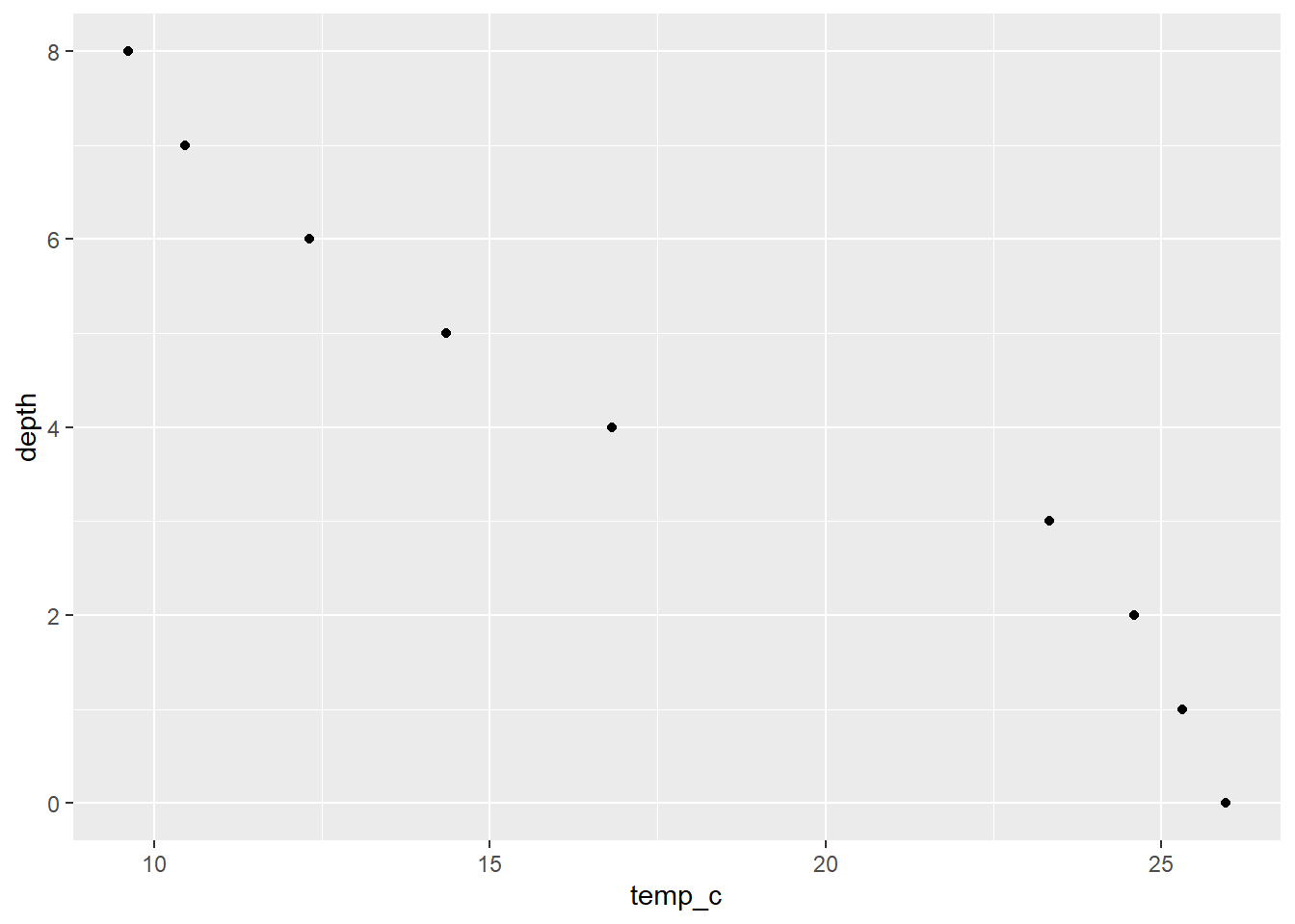
Now there’s some data! Granted the figure is ugly, but it’s a start! Let’s connect the dots next:
ggplot(data = university_lake, aes(x = temp_c, y = depth)) +
  geom_point() +
  geom_path()
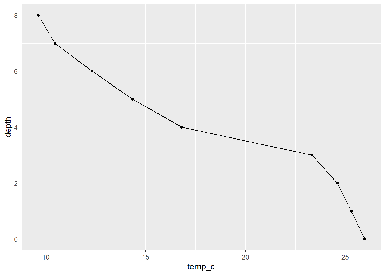
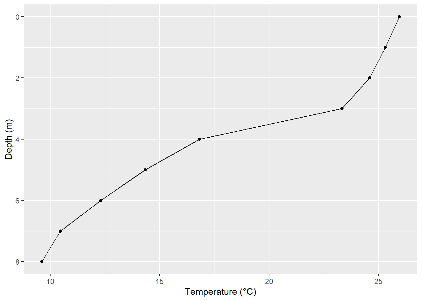
When visualizing depth profiles, it is more intuitive to have the surface measurement at the top (“0” in our case). scale_y_reverse() makes that task quite simple:
ggplot(data = university_lake, aes(x = temp_c, y = depth)) +
  geom_point() +
  geom_path() +
  scale_y_reverse()
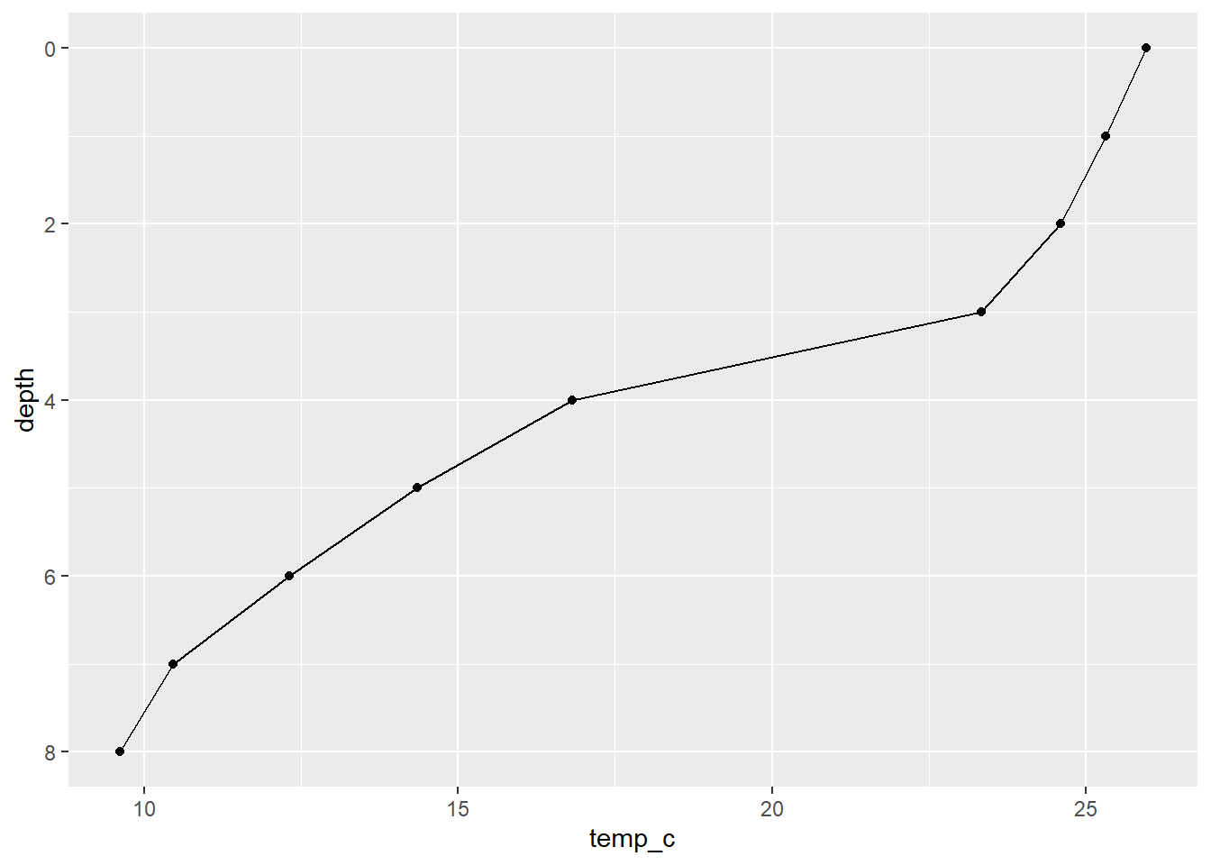
Much better, at least intuitively. Now we should make things less harmful to the eyes.
Making things nice
The first aspect I normally look to change are the axis breaks and titles I’m actually happy with the default breaks in this case, so we just need to rename the axis titles with labs():
ggplot(data = university_lake, aes(x = temp_c, y = depth)) +
  geom_point() +
  geom_path() +
  scale_y_reverse() +
  labs(
    x = "Temperature (°C)",
    y = "Depth (m)"
  )
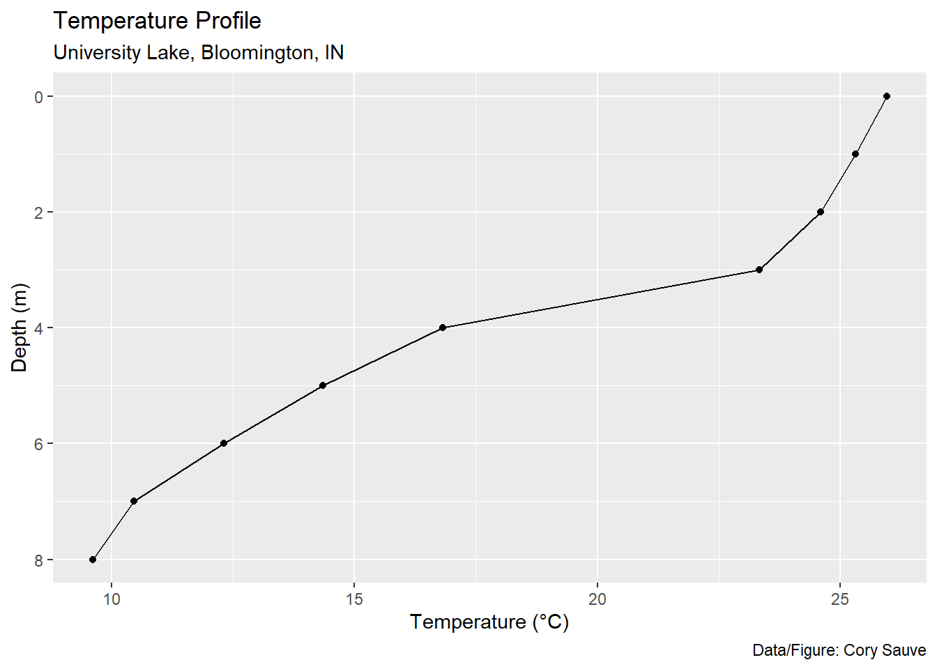
You can also add a title, subtitle, and figure caption within labs():
ggplot(data = university_lake, aes(x = temp_c, y = depth)) +
  geom_point() +
  geom_path() +
  scale_y_reverse() +
  labs(
    x = "Temperature (°C)",
    y = "Depth (m)",
    title = "Temperature Profile",
    subtitle = "University Lake, Bloomington, IN",
    caption = "Data/Figure: Cory Sauve"
  )
If you’re making a figure for a scientific report or publication, we’d want this information at the bottom:
ggplot(data = university_lake, aes(x = temp_c, y = depth)) +
  geom_point(size = 1.5) +
  geom_path(size = 1) +
  scale_y_reverse() +
  labs(
    x = "Temperature (°C)",
    y = "Depth (m)",
    caption = "Fig 1: Temperature profile for University Lake, Bloomington, IN"
  ) +
  theme(plot.caption = element_text(hjust = 0, vjust = -0.5, size = 12))
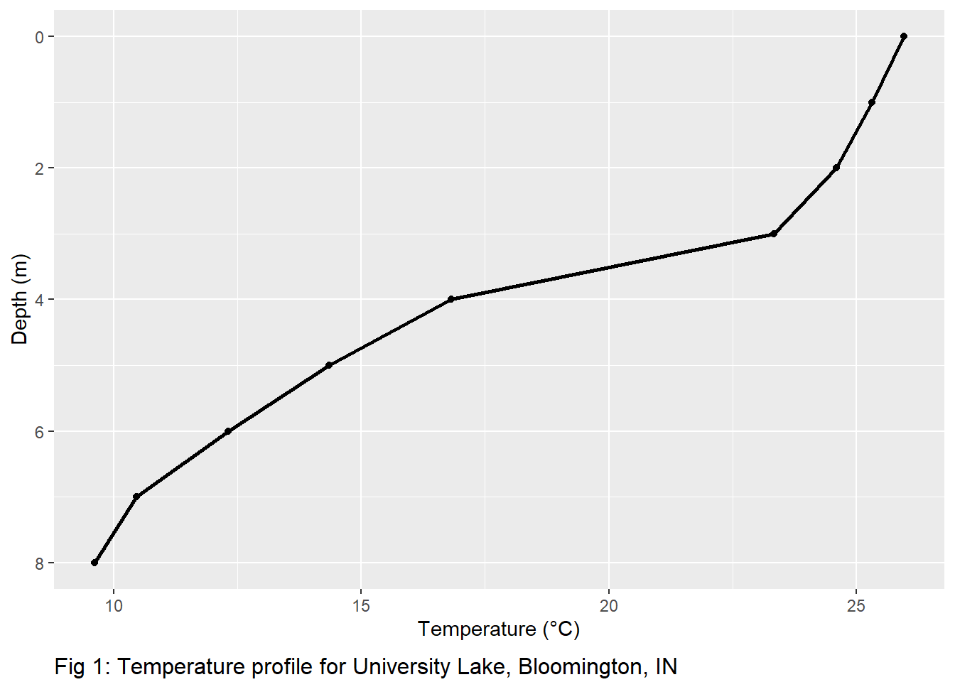
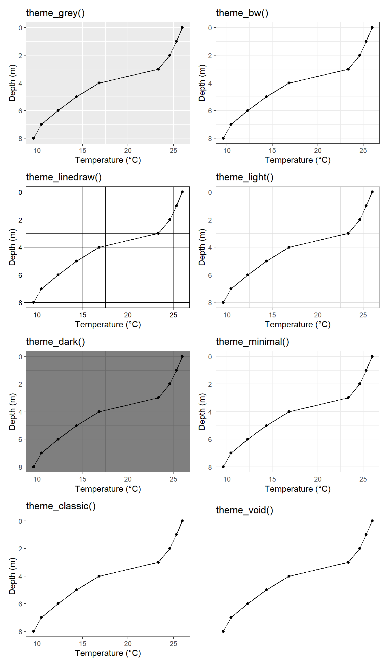
Notice the use of theme() here to change the position and size of the caption. We can modify almost every aspect of our figure with theme(). ggplot2 also has quite a few built in themes if you’re in a hurry:
In our case, we’re going to start with theme_light() and modify to our liking with theme():
ggplot(data = university_lake, aes(x = temp_c, y = depth)) +
  geom_point() +
  geom_path() +
  scale_y_reverse() +
  labs(
    x = "Temperature (°C)",
    y = "Depth (m)",
    caption = "Fig 1: Temperature profile for University Lake, Bloomington, IN"
  ) +
  theme_light() +
  theme(
    axis.text = element_text(size = 12),
    axis.title = element_text(size = 14),
    plot.caption = element_text(hjust = -1, vjust = -10, size = 14),
    plot.margin = unit(c(1, 1, 1.5, 1), "cm")
  )
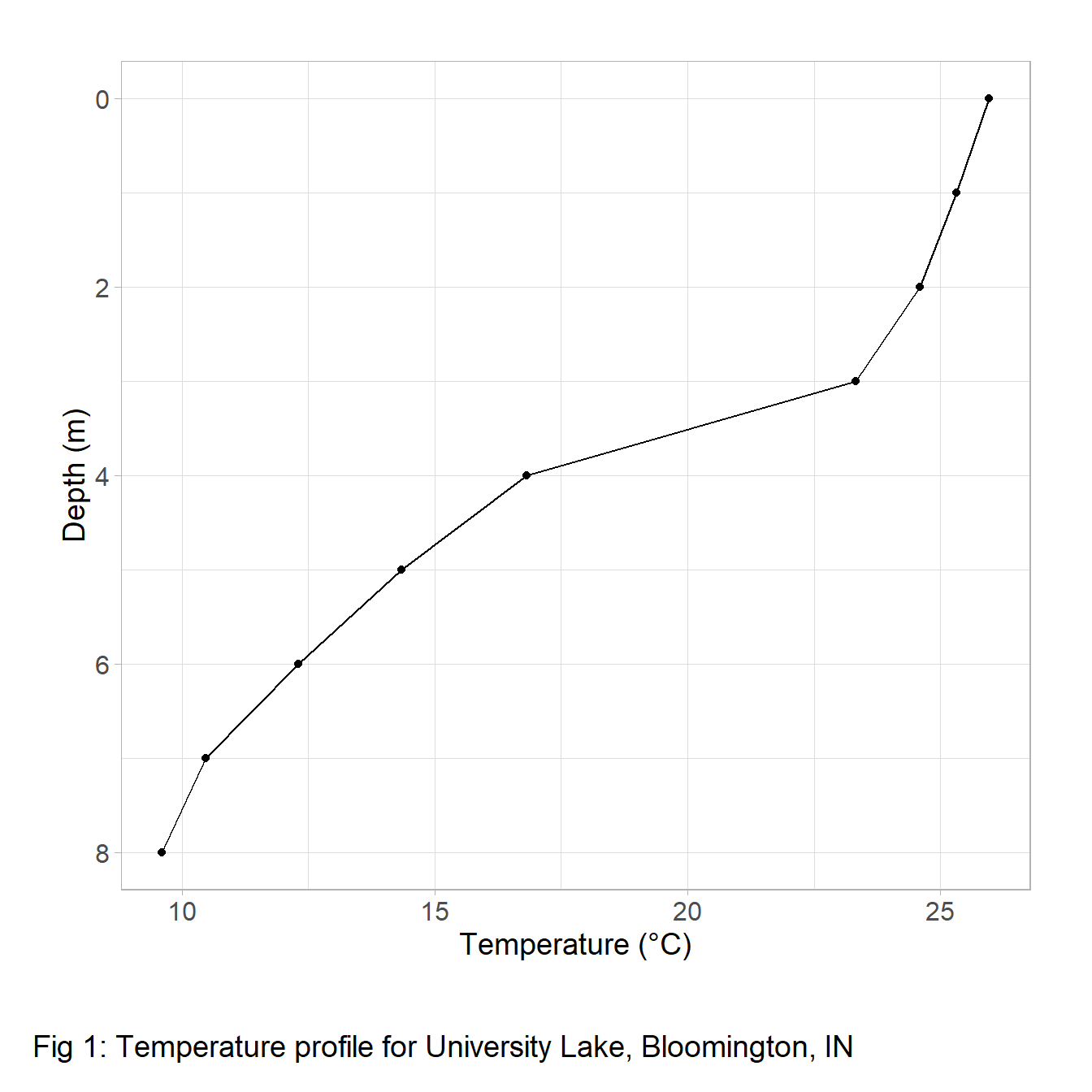
We did it! We now have a high-quality temperature profile. If you want to save this figure, you can do so with ggsave():
ggsave(last_plot(), filename = "path/to/save/figure.png", height = 8, width = 12, dpi = 500)