Visualizing many profiles with {patchwork}
How to visualize multiple lake profiles with {ggplot2} and {patchwork}
By Cory Sauve
December 6, 2021
Overview
For this post, we’re going to build off of the
Visualizing Lake Profiles post and learn how to make subplots with patchwork. We’ll also add some annotations to the final plots.
Some housekeeping
We’ll be using the r4es package for the dataset in this post. It’s currently available on my
GitHub and can be downloaded by:
# install.packages("devtools")
devtools::install_github("corysauve/r4es")
A quick refresher
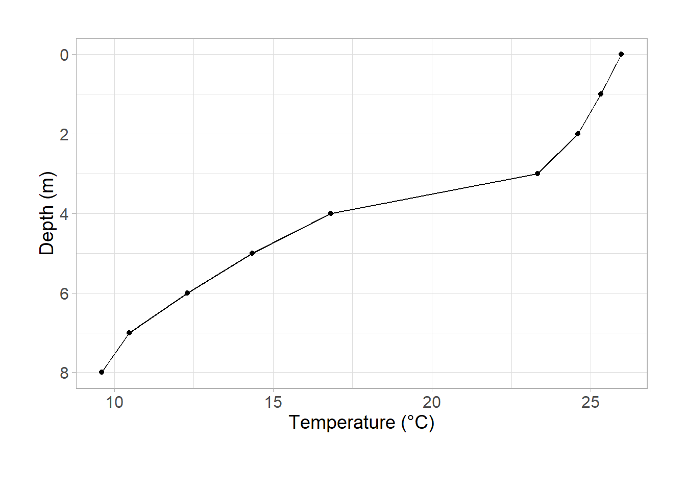
Last time, we made a temperature profile using ggplot2:
library(r4es)
library(ggplot2)

ggplot(data = university_lake, aes(x = temp_c, y = depth)) +
  geom_point() +
  geom_path() +
  scale_y_reverse() +
  labs(
    x = "Temperature (°C)",
    y = "Depth (m)"
  ) +
  theme_light() +
  theme(
    axis.text = element_text(size = 12),
    axis.title = element_text(size = 14),
    plot.caption = element_text(hjust = -1, vjust = -10, size = 14),
    plot.margin = unit(c(1, 1, 1.5, 1), "cm")
  )
This time we’ll visualize additional parameters and compose them together into one plot.
Let’s first remind ourselves what the data look like:
dplyr::glimpse(university_lake)
#> Rows: 9
#> Columns: 28
#> $ lake_name          <chr> "University", "University", "University", "Universi~
#> $ depth              <dbl> 0, 1, 2, 3, 4, 5, 6, 7, 8
#> $ temp_c             <dbl> 25.96, 25.32, 24.60, 23.33, 16.82, 14.35, 12.31, 10~
#> $ do_mgl             <dbl> 11.89, 14.78, 11.75, 2.53, 0.40, 0.00, 0.00, 0.00, ~
#> $ do_sat_per         <dbl> 162.2, 183.7, 143.2, 30.0, 0.4, 0.0, 0.0, 0.0, 0.0
#> $ cond_umhos         <dbl> 310.2, 298.6, 340.4, 386.0, 390.8, 375.8, 359.9, 35~
#> $ light_sur_mmol     <dbl> 1817, 3609, 1900, 2528, 3719, 1754, 1519, 1934, 2176
#> $ light_dep_mmol     <dbl> 1817.00, 259.10, 23.21, 4.38, 0.00, 0.00, 0.00, 0.0~
#> $ ph                 <dbl> 8.9, 8.9, 7.4, 8.0, 7.0, 7.0, 6.5, 6.8, 6.5
#> $ alk_mgl            <dbl> 95, 91, 110, 102, 164, 152, 171, 170, 206
#> $ turb_ntu           <dbl> 11.5, 12.0, 10.2, 11.6, 31.4, 23.4, 29.6, 32.8, 38.9
#> $ srp_mgl            <dbl> 0.004, 0.009, 0.005, 0.021, 0.008, 0.019, 0.056, 0.~
#> $ tp_mgl             <dbl> 0.049, 0.048, 0.050, 0.052, 0.037, 0.050, 0.079, 0.~
#> $ nh3_mgl            <dbl> 0.015, 0.015, 0.015, 0.015, 0.129, 0.548, 0.905, 1.~
#> $ no3_mgl            <dbl> 0.015, 0.010, 0.011, 0.010, 0.014, 0.016, 0.012, 0.~
#> $ tn_mgl             <dbl> 1.153, 1.132, 0.933, 0.955, 0.940, 0.985, 1.352, 1.~
#> $ chla_ugl           <dbl> 49.837, 61.845, 69.054, 72.105, 24.923, 15.433, 8.6~
#> $ dolichospermum_nul <dbl> 56560.0, 147280.0, 45749.3, 68381.0, 20821.0, 21903~
#> $ aphanizomenon_nul  <dbl> 13440.0, 19040.0, 7780.5, 0.0, 5923.0, 5227.0, 2976~
#> $ microcystis_nul    <dbl> 1120.0, 1120.0, 778.1, 0.0, 2513.0, 12196.0, 16505.~
#> $ ceratium_nul       <dbl> 3800, 408, 773, 305, 0, 0, 0, 0, 0
#> $ nauplii_nul        <dbl> 16.8, 26.1, 0.3, 12.0, 0.0, 9.5, 0.0, 0.0, 5.3
#> $ bosmina_nul        <dbl> 1.2, 1.1, 0.2, 4.5, 1.1, 2.4, 1.4, 3.9, 0.0
#> $ calanoid_nul       <dbl> 12.0, 13.5, 1.2, 22.5, 3.4, 11.8, 0.0, 3.9, 16.0
#> $ cyclopoid_nul      <dbl> 3.0, 2.3, 0.4, 18.0, 9.1, 49.7, 7.0, 19.5, 32.0
#> $ chaoborus_nul      <dbl> 0.0, 0.0, 0.0, 0.0, 0.0, 0.6, 0.5, 0.0, 0.1
#> $ orgn_mgl           <dbl> 1.123, 1.107, 0.907, 0.930, 0.797, 0.421, 0.435, 0.~
#> $ light_level_per    <dbl> 100.0, 7.2, 1.2, 0.2, 0.0, 0.0, 0.0, 0.0, 0.0
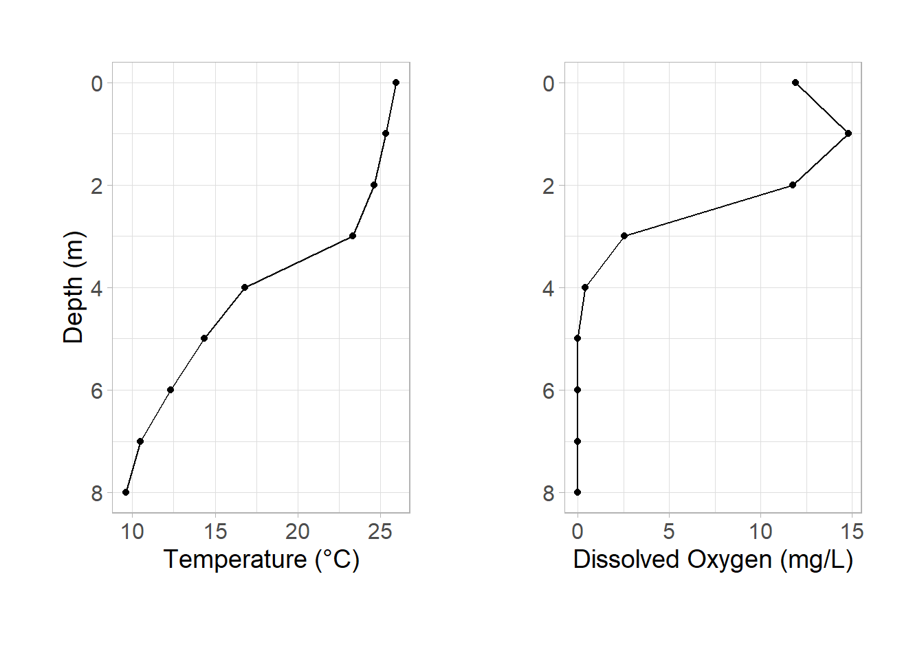
Dissolved oxygen
Dissolved oxygen and temperature are commonly plotted on the same figure in limnology. The major flaw with doing this on the same axis is that it is difficult to interpret since each have different scales. Instead, plotting each parameter as a different subplot allows for both to be interpreted by the reader simultaneously while not running into a scale issue.
ggplot2 doesn’t allow you to even plot two lines of differing scales on the same plot (for good reason). We could accomplish this using base graphics, but should we? I think not.
Since we already have our temperature plot, we just need to replicate the same thing but with do_mgL. Most of our elements can be copied, but pay close attention to:
aes(x = ...)labs(x = "...")
Let’s make the initial plot:
ggplot(data = university_lake, aes(x = do_mgl, y = depth)) +
  geom_point() +
  geom_path() +
  scale_y_reverse(name = "Depth (m)") +
  labs(
    x = "Dissolved Oxygen (mg/L)",
    y = "Depth (m)"
  ) +
  theme_light() +
  theme(
    axis.text = element_text(size = 12),
    axis.title = element_text(size = 14),
    plot.caption = element_text(hjust = -1, vjust = -10, size = 14),
    plot.margin = unit(c(1, 1, 1.5, 1), "cm")
  )
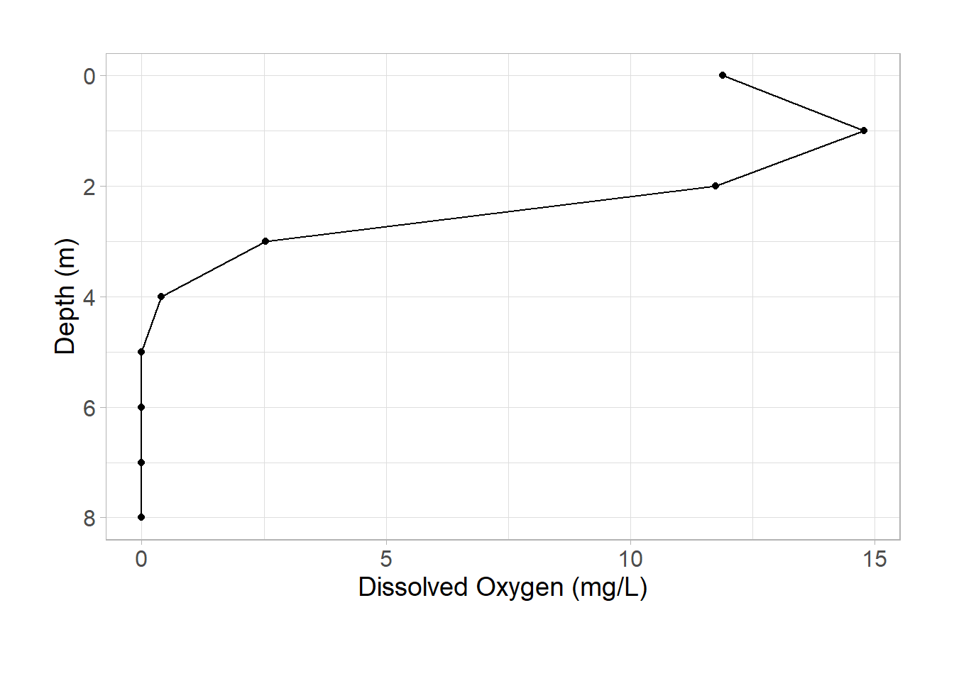
Looks good! Now we need to save each subplot as an object to ensemble our patchwork:
p_temp <-
  ggplot(data = university_lake, aes(x = temp_c, y = depth)) +
  geom_point() +
  geom_path() +
  scale_y_reverse() +
  labs(
    x = "Temperature (°C)",
    y = "Depth (m)"
  ) +
  theme_light() +
  theme(
    axis.text = element_text(size = 12),
    axis.title = element_text(size = 14),
    plot.caption = element_text(hjust = -1, vjust = -10, size = 14),
    plot.margin = unit(c(1, 1, 1.5, 1), "cm")
  )

p_do <-
  ggplot(data = university_lake, aes(x = do_mgl, y = depth)) +
  geom_point() +
  geom_path() +
  scale_y_reverse(name = "Depth (m)") +
  labs(
    x = "Dissolved Oxygen (mg/L)",
    y = "Depth (m)"
  ) +
  theme_light() +
  theme(
    axis.text = element_text(size = 12),
    axis.title = element_text(size = 14),
    plot.caption = element_text(hjust = -1, vjust = -10, size = 14),
    plot.margin = unit(c(1, 1, 1.5, 1), "cm")
  )
Creating our patchwork
Now that we have our figures saved as objects (p_temp, p_do), it’s time to make our final plot with the
patchwork package.
We are only going to scratch the surface of what patchwork can do. Our use case is going to be quite simple (two side-by-side plots) so stay tuned for more complicated figure compositions in the future.
To combine our figures, we simply add them together:
library(patchwork)

p_temp + p_do
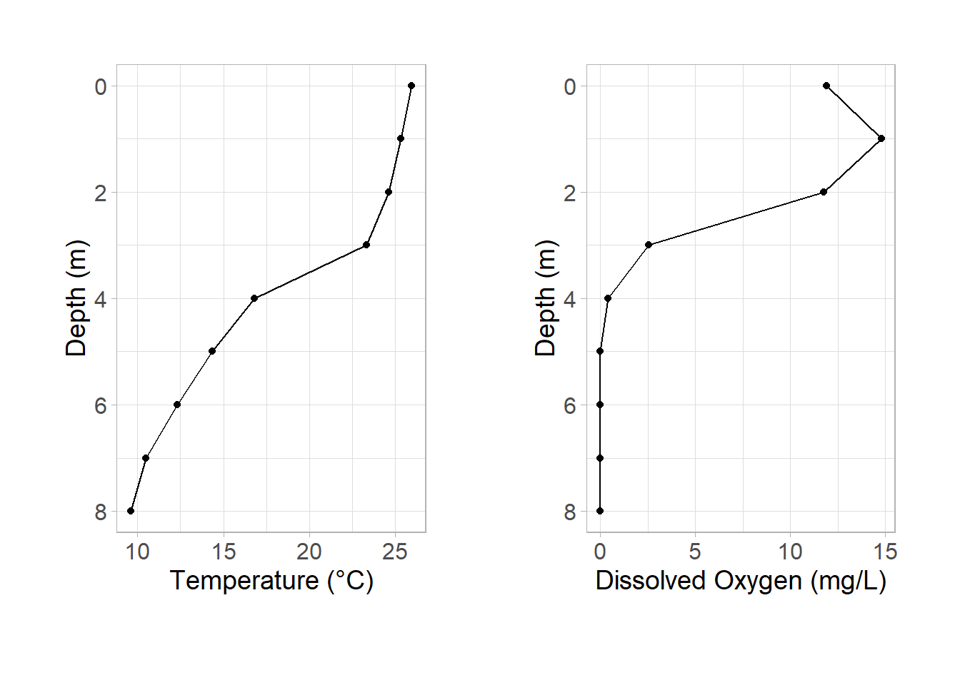
Congrats! We have the start of our final figure. It’s really remarkable how simple patchwork makes this task. We can expand our initial plot to make it cleaner.
Combining axis titles
In my opinion, when subplots share the same y-axis it is best to only show one. I generally preserve the left subplot and remove the right subplot:
# p_temp stays the same, so no need to override
p_do <-
  ggplot(data = university_lake, aes(x = do_mgl, y = depth)) +
  geom_point() +
  geom_path() +
  scale_y_reverse(name = "") +
  labs(
    x = "Dissolved Oxygen (mg/L)",
    y = ""
  ) +
  theme_light() +
  theme(
    axis.text = element_text(size = 12),
    axis.title = element_text(size = 14),
    plot.caption = element_text(hjust = -1, vjust = -10, size = 14),
    plot.margin = unit(c(1, 1, 1.5, 1), "cm")
  )

p_temp + p_do
Simplifying the theme
You may have noticed that we have some duplicated code in theme(). Perhaps a cleaner alternative is to create each figure and then apply the theme after we create our patchwork:
p_temp <-
ggplot(data = university_lake, aes(x = temp_c, y = depth)) +
geom_point() +
geom_path() +
scale_y_reverse() +
labs(
x = "Temperature (°C)",
y = "Depth (m)"
)
p_do <-
ggplot(data = university_lake, aes(x = do_mgl, y = depth)) +
geom_point() +
geom_path() +
scale_y_reverse(name = "") +
labs(
x = "Dissolved Oxygen (mg/L)",
y = "Depth (m)"
)
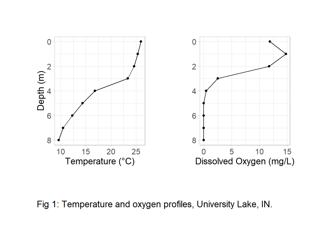
plot <- p_temp + p_do
plot &
plot_annotation(caption = "Fig 1: Temperature and oxygen profiles, University Lake, IN.") &
theme_light() &
theme(
axis.text = element_text(size = 12),
axis.title = element_text(size = 14),
plot.caption = element_text(hjust = 0, vjust = -1, size = 14),
plot.margin = unit(c(1, 1, 1.5, 1), "cm")
)